Monday, March 11, 2013

Personal Series 3


This is our 3rd set for our Personal Series. For my negative space series, I kept the black and white filter along with the boosted contrast. This was for contrast between objects and the sky. For this set, I had a little bit more buildings and urban structures. I tilted the camera as well to create diagonal lines within the photographs as well.

Wednesday, February 27, 2013

Personal Series #2


This week we were working on our personal series. I was working on negative space, and from previous reviews and comments I emphasized on a black and white with a boosted contrast effect, but mostly of leaves and foliage. There was some urban buildings in some of the photos, but those photos incorporate nature and only a little bit of urban man-made structures. 

Thursday, February 14, 2013

Personal Series


This week we worked on our personal projects with objectives we wanted to complete personally, and I wanted to work on Negative Space. I tried different effects, using contrast, black and white, and brightness adjustment. I decided to keep some color in some photos to create negative space.

Monday, February 11, 2013

Personal Series/Topics

For our next set of photos, we were instructed to come up with 3 ideas to focus on:
1. Motion: Mostly of cars on the road, sometimes focusing on cars on the road or the setting around it.
2. Shadows and Reflections (Maybe some negative space)
3. Narratives: Telling a story, also looking to incorporate the previous points in a story.

Thursday, February 7, 2013

Negative Space


These past two weeks we worked on negative space. We did this by using outlines, shapes and shadows to create negative space. I walked around Drew and found many different things I could work with. Also, for editing, I put the pictures in black and white to make the shapes pop more and also boosting the contrast helps with the shapes popping out.

Monday, January 28, 2013

Experiemental Series

This was an experimental series that we were working on individually. I decided to focus on light paintings with various effects on photoshop and picmonkey. Mostly, the neopn glow effect in photoshop combined with other effects in picmonkey.
This photo was editied with the neon glow effect in Photoshop and was boosted in Picmonkey.
This was used with a neon glow effect in Photoshop and the burst effect in picmonkey.

This was also another neon glow effect, with the glow size smaller that the previous ones.

The photo here was edited with the sepai effect with a red/ yellow tone in picmonkey

This was edited using the glowing edges effect in photoshop

This was also another neon glow photo with green in photoshop, with a full contrast boost and color boost in picmonkey.

This paitng used the neon glow effect in Photoshop with the focal zoom effect in picmonkey.

The neon glow effect was used slightly in this one with a cross process blue effect in picmonkey.
This was edited in photoshop with the select tool and the neon glow effect, the glowing edges effect, the under-painting effect, and various glow sizes.

Thursday, January 17, 2013

Experimental Sketchbook

This assignment was to experiment with different texts, filters, and effects on Photoshop and Picmonkey. Some pictures have text. The ones that have text are supposed to portray an emotion or personal feeling. The Ones with just effects were just for experimentation.

This was a depth photograph and I edited it with Picmonkey. I used the Gritty filter on Picmonkey, and added the text from Picmonkey as well. Text Style : Downcome

  This was a light painting photo I took. The effect was watercolor on the Photoshop Filters.
 This was a Light painting photo that I edited with Photoshop and Picmonkey. What i did was i used the glowing edges filter on Photoshop and made that glow color green. I then took this newly modified photograph and added the Burst effect on Picmonkey to boost the color and make it more vibrant.
 This was a Depth Repetition photo, and used Picmonkey to edit this. I used the Lomo effect to darken and blur the edges slightly, and I added text as well. Text: Downcome
This picture was edited with Picmonkey. I used the Downcome text again to experiemtn with it, since it really liked it. also the effect I used was the Gritty effect, but I kept it lighter, instead of darkening the photo.
This photo was edited in Picmonkey. I used the Tranquil effect. The text on the flower was La Belle Aurore style text.
This was another light painting, but here I used the sepia effect on Picmonkey and gave it a red glow, not only on the light, but a dark red background as well.
The photo was edited on Photoshop using the chrome effect. I like it since it makes the photograph seem as if it was molded into a chrome plate.
This was another levitation photo. I used Photoshop's Glowing edges effect to make the outlines of the picture glow and really pop from the dark parts of it.
This was a motion photo. Although I moved the camera when I took the photo, I added a soften effect to make it seem more dynamic in Picmonkey.
 This was another levitation photo I took and I used Picmonkey to add text and use the Urbane effect to give it a reddish look. Text name: Sketch Block
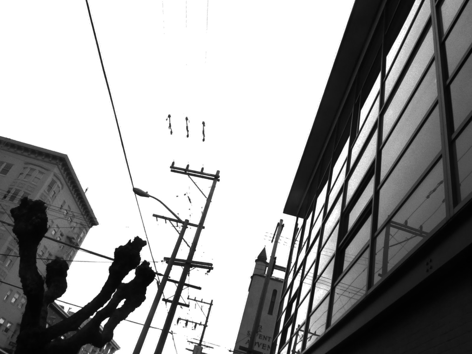
This was a photo that I took on California street. I boosted the vibrance and contrast slightly, and then I used Picmonkey's Focal zoom tool to give the picture a sense of motion.